
How our logo was created
Every business needs a brand identity.
A brand identity is essentially a business’s ‘personality’, and is made up of several visual and non-visual elements. It promotes a company’s values and helps to create an authentic and positive relationship with the target audience.
One of the key visual elements is the logo or ‘brand mark’.
A successful logo is:
memorable
unique
representative of the brand’s identity
instantly recognisable
A logo can be made up of either one or a combination of these elements:
a graphic or image (think Apple)
a wordmark (think Coca-Cola)
a letterform (think HBO)
**SPOILER: we combined all three!**
Here’s how the design team at Elephant Page developed our logo:
STAGE 1: IDEATION

We first began with brainstorming around our mission statement and target audience. We needed something simple that would look good when printed and on our website, socials or the spine of a book.
Next, we started sketching basic concepts that we presented to the rest of the publishing house for a vote – we are a collaborative group after all.
Based on the feedback, we sketched some more ideas.
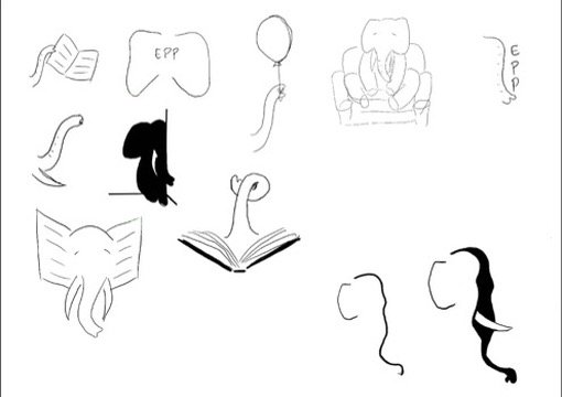

We wanted a youthful feel, but not childish.
We wanted to be bold, but not cliché.
We wanted to be clever, but not obscure.
After a couple more rounds of sketching and feedback, it was clear that we all loved silhouette-style graphics and the cursive ‘EP’ letterform.
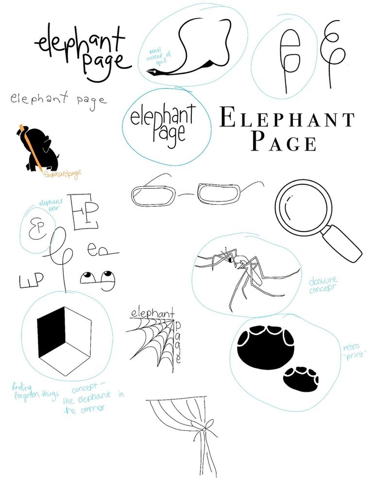
STAGE 2: DEVELOPMENT
Now that we had a basic art style and idea for the logo, we began developing some higher-quality concepts. These concepts combined the EP letterform and the elephant silhouette.


After another vote and feedback session, we finally picked the main image for our logo!

The silhouette of the elephant head was straightforward and bold.
Using the EP letterform as the ear of the elephant was a subtle way to encourage our audience to look twice and take notice.
We’d created an image that was memorable, unique and instantly recognisable.
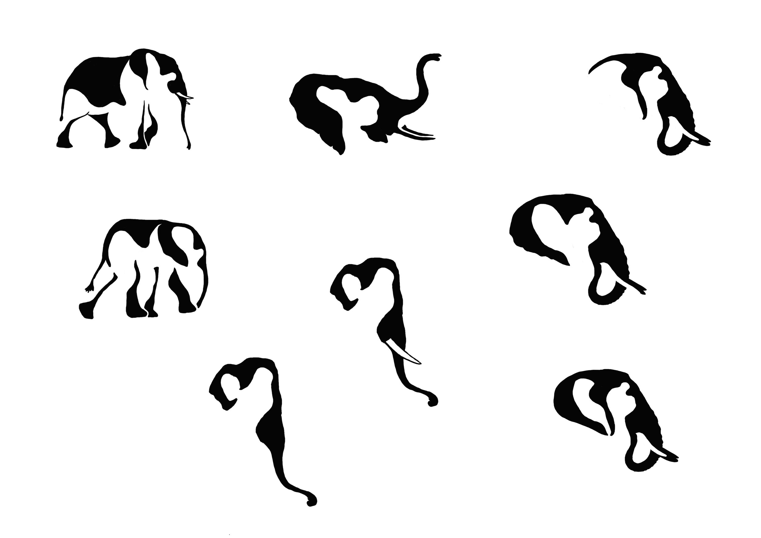
STAGE 3: REFINEMENT
The final phase for the graphic part of our logo involved refining it. We had to ask ourselves a few questions in doing so.
Did we want tusks on our elephant or no tusks?
Did we want skin wrinkles on the elephant’s trunk and ear?
Did we want the EP to be ‘fatter’ or ‘sharper’?


Here’s what we decided on:

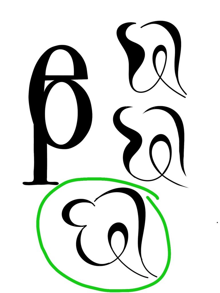
STAGE 4: WORDMARK
With the image part of our logo complete, we started to work on the wordmark.
A wordmark is the text part of a logo. It can stand as a logo by itself, or it can combine with an image to create a larger logo.
As the graphic for our logo was simple and bold, we wanted a wordmark with similar qualities. But it also needed to show some personality – something that aligned with our brand identity.
First, we had to decide on a font. We tried many different serif, sans serif and script fonts. We tried handwriting, cursive and even combining different fonts.


Finally, we narrowed it down.


We wanted a cursive E and P to complement the letterform in our graphic. And we wanted a ‘handwriting’ style of font. But the problem with most of those was that they weren’t bold enough to go with our elephant.
Eventually, we created a wordmark that was in a cursive/handwriting style, was bold and had some character. With the letters being on different baselines, it added the youthfulness and a little bit of fun that is a part of being a student.

STAGE 5: FINALISING THE BRANDMARK
Now that we had both the graphic and wordmark parts of our logo, we needed to put them together.
The layout of a brandmark is just as important as the individual elements of the mark. The parts need to work in harmony with each other.
They need to be balanced and draw the eye.
To do this, we had to consider the hierarchy of the elements – basically, which part is most important.
As the graphic will be used on its own for lots of things (such as socials and the spine of a book), it needed to be the first thing people notice.
Its job is to draw attention, and then direct that attention to the wordmark.
That’s why these layouts didn’t work:


We needed the graphic to be before or above the text. But placing the image above the wordmark didn’t quite work, as the elephant didn’t seem to appear balanced in the centre.
The balance of the brandmark was off.
As a result, the graphic had to go before the wordmark. After looking at a few variations of this layout, we went down a simple route.
The elephant is double the height of the text, making it the dominant element in the hierarchy. Because of its bold nature and larger size, a viewer will notice the graphic first. And because of its shape and the direction it faces, it will naturally draw a viewer towards the text.
The wordmark is centered vertically with the graphic, and the space between both elements is the same as between the words.
This gives the brandmark its balance and harmony.

And there you have it! That’s the story of the creation of our logo.
Thank you for supporting our team and reading our blog, we have plenty more exciting behind-the-scenes pieces coming very soon.